Client project · Innovate Product Design
Property, browsed like reels.
An enhanced, modernised letting application for the real-estate market, bringing agents and buyers together.
The what
House hunting, with the pull of a reels feed.
The client wanted a new kind of property app: one where buyers scroll through reels of listed homes with the same habit they bring to Instagram and TikTok, so browsing property feels like the apps people already enjoy.
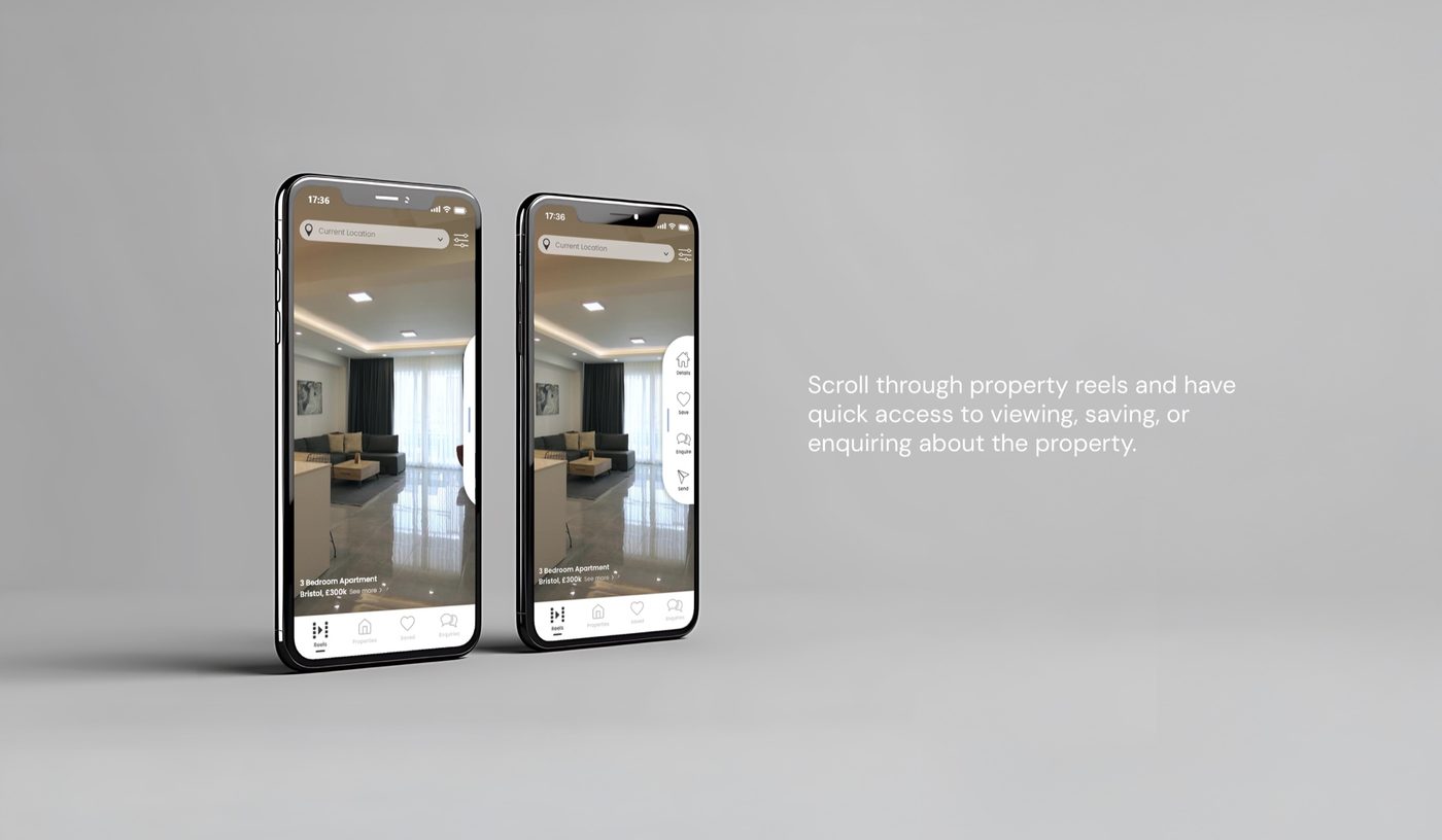
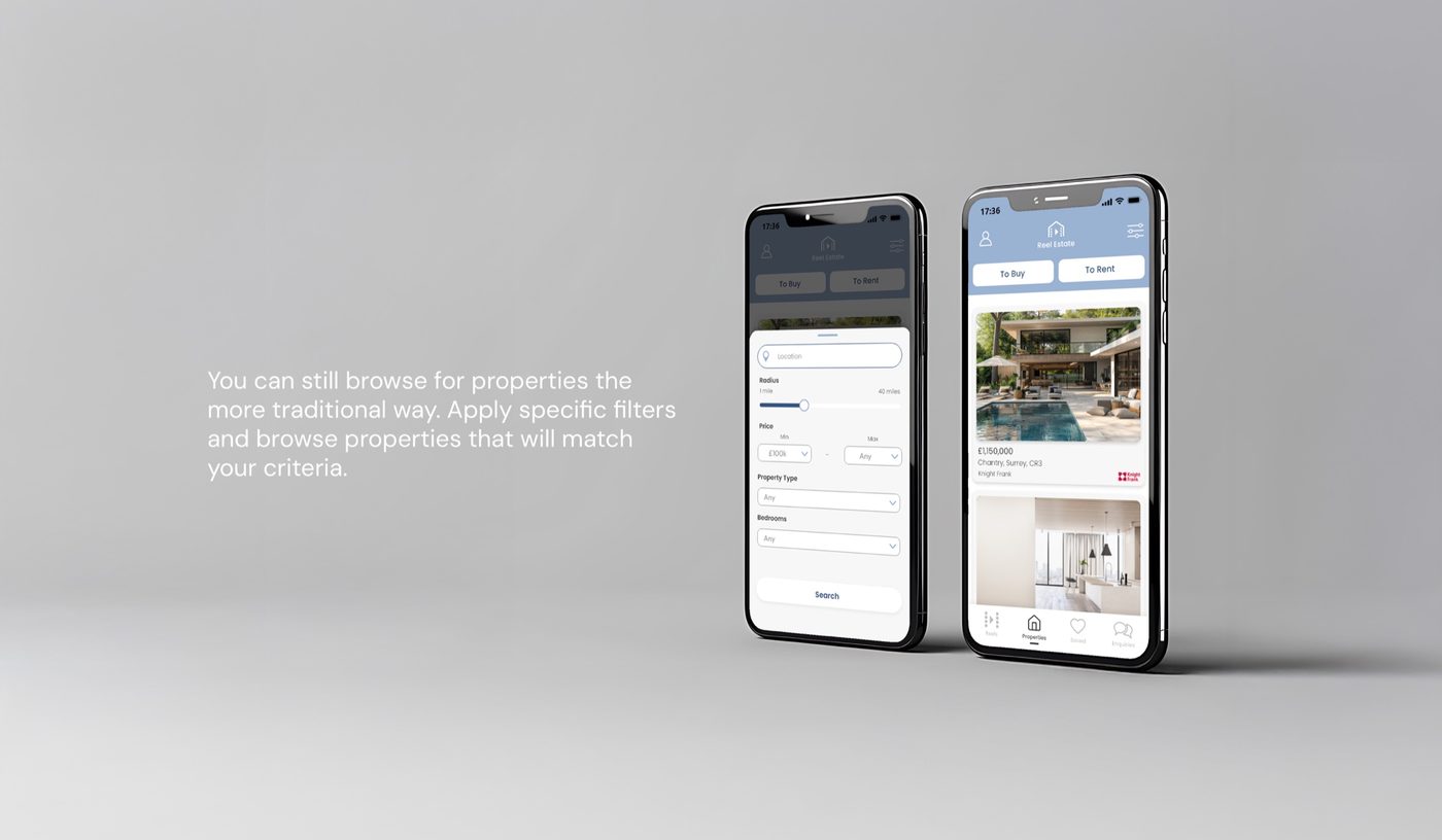
Two things were fixed from the start. The home screen is a reel, ready to scroll the moment the app opens and filled with homes that match your interests and searches. There is also still a traditional search, by specification and location, for anyone who knows what they want. This further developed into a B2B2C app, where buyers and letting agents can interact with one another to engage from both sides of a listing.
The why
Browsing property is still a chore.
People have grown used to scrolling through reels and images all day. The client saw a field that is still tedious and barely visual, and a chance to change that.
The big property sites, Rightmove and Zoopla among them, offer nothing in their interfaces that makes browsing, whether for fun or to buy, anything other than a chore.
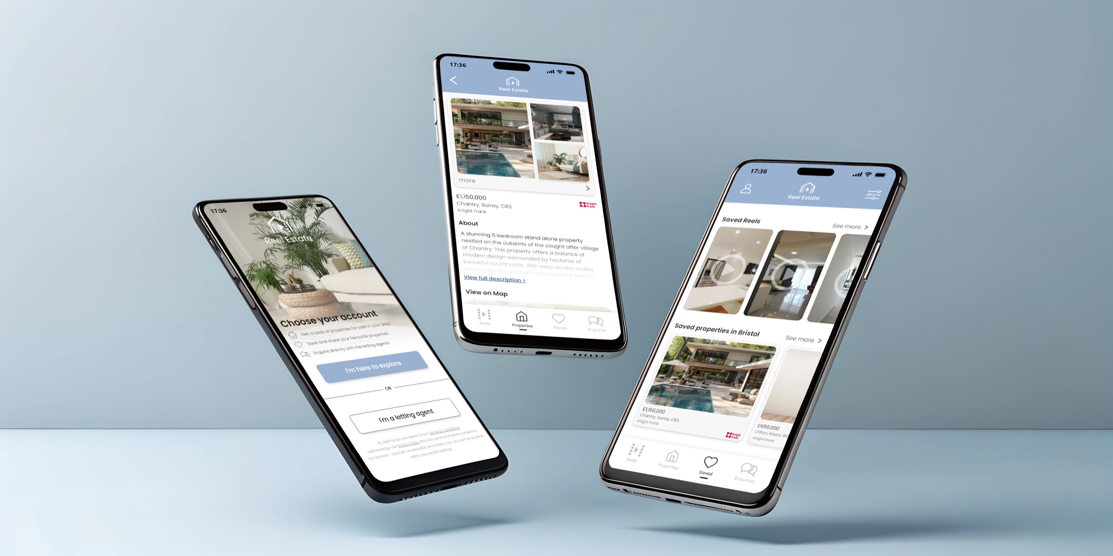
Fig. 01
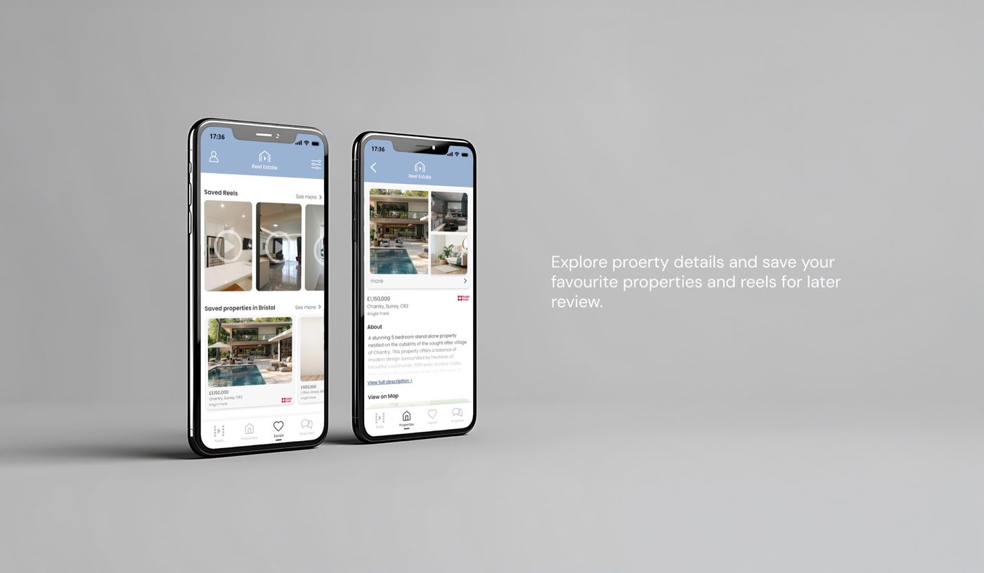
Choosing an account, a listing, and the homes and reels you’ve saved.
The how
Competitors first, then a spec the client signed off.
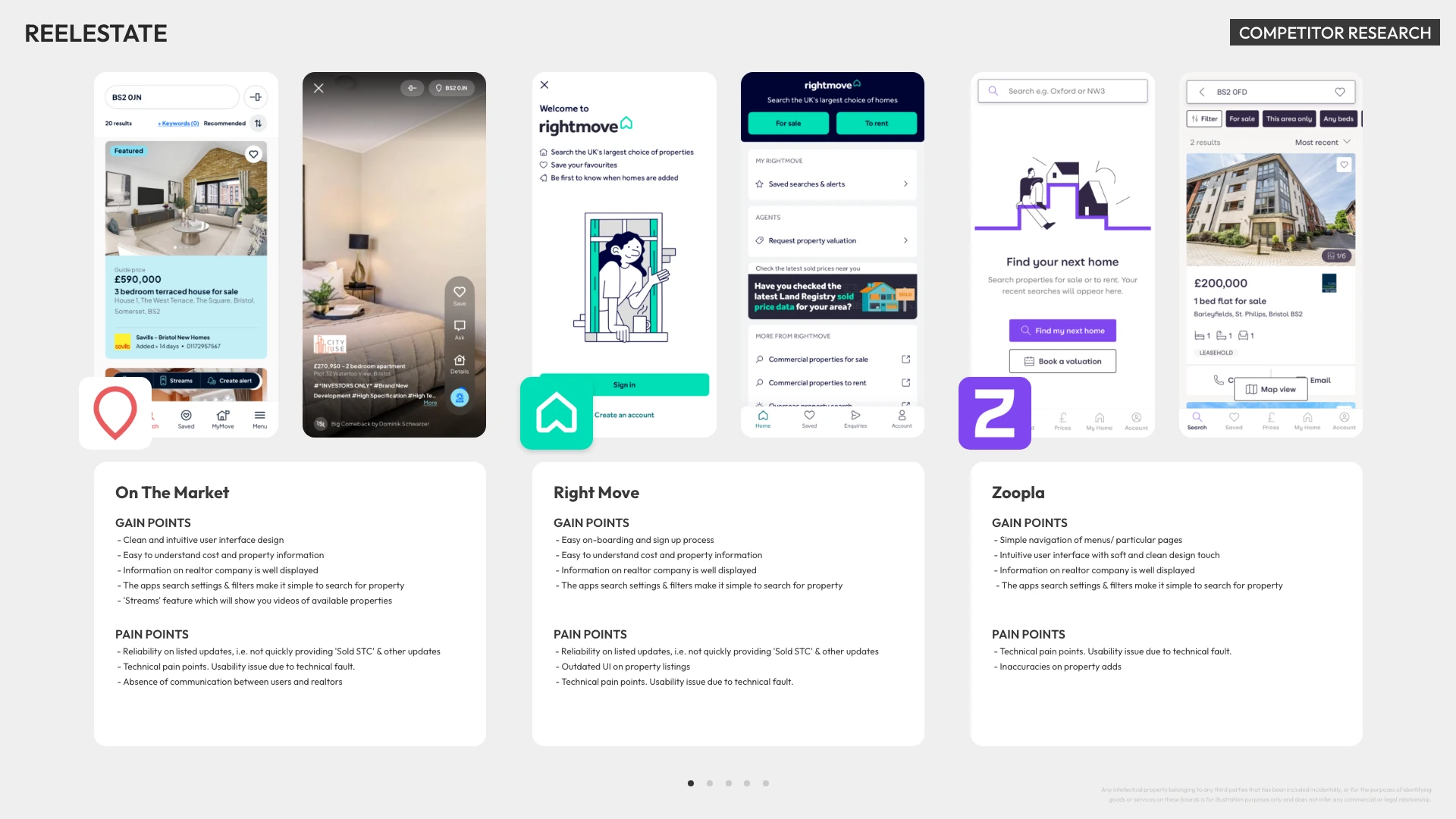
I started with direct competitor research: downloading the leading property apps, reviewing their design and key features, and reading their customer reviews to find the pain points and gain points.
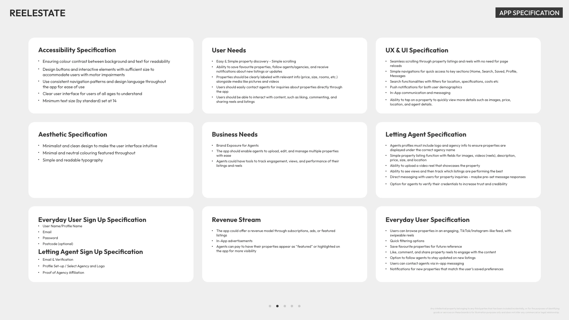
That kept the design on the client’s brief while serving the wider range of people who would use it. From the research I wrote a set of app specifications for the client to approve before any prototype was designed.
Fig. 02
Competitor research, and the specification the client approved before design began. Open either to read it in full.
Finished MVP screens
One app, two ways in.
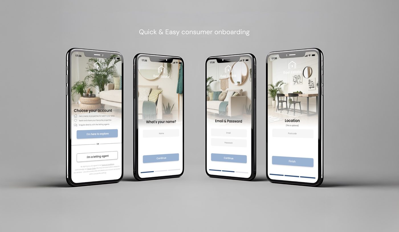
The finished MVP covers both sides of a listing. Buyers sign up in a few quick steps, then scroll property reels with viewing, saving and enquiring a tap away. They can also search the traditional way with filters, and save homes and reels to review later.
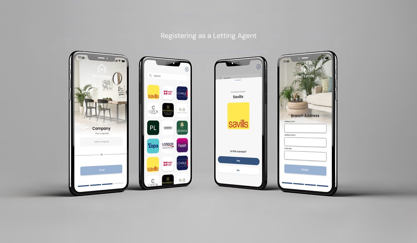
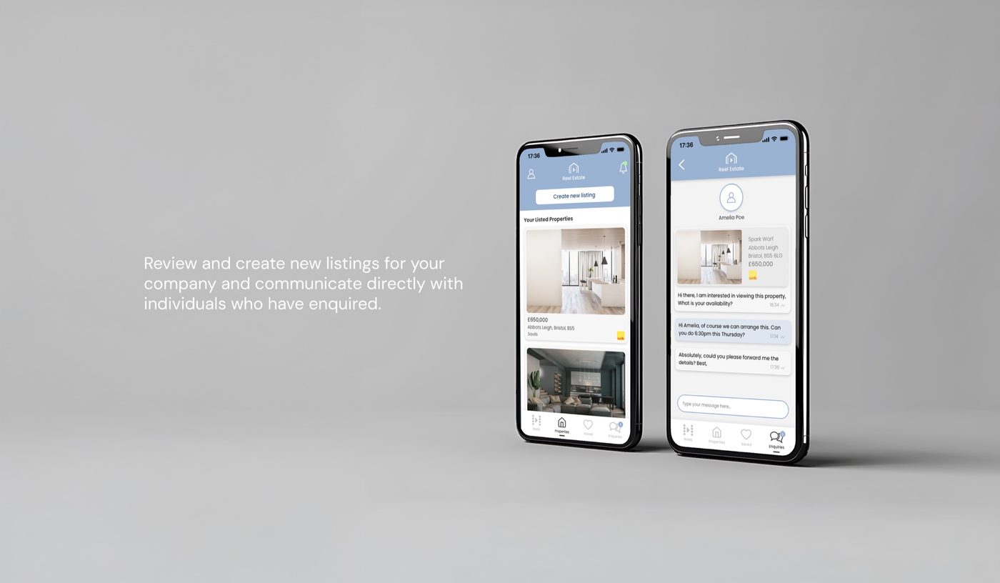
Letting agents start by registering their company. They can then create and review listings, and talk directly with the people who enquire.
Fig. 03
The MVP screens: buyers first, then letting agents.