 All work
Live brief · Creative Navy
Booking a GP in as few taps as possible.
A private clinic expanding across the UK wanted patients off the phone lines and into an app, with a booking flow as quick as it can be and as detailed as a patient needs.
The what
A live brief, with the real client kept confidential.
This project took place during my accelerator course with King’s College: a live employer project, working alongside Creative Navy for a client of theirs.
Because of the confidentiality Creative Navy held with that client, we worked to a hypothetical case, ‘Harley Hospital’, not to be confused with Harley Street Hospital.
The why
The phone lines can’t keep up.
Harley Hospital is a private medical clinic expanding quickly, with clinics around the UK. It wanted booking an appointment with its registered GPs to be as quick and efficient as possible.
That meant moving away from the overwhelmed telephone booking systems still widely used today, to a booking system in a proposed new app.
Our task was to create and demonstrate a user flow for that booking: an appointment in as few taps as possible, while still letting a patient be as detailed as they need to be.
The how
Interviews and competitors set the spec.
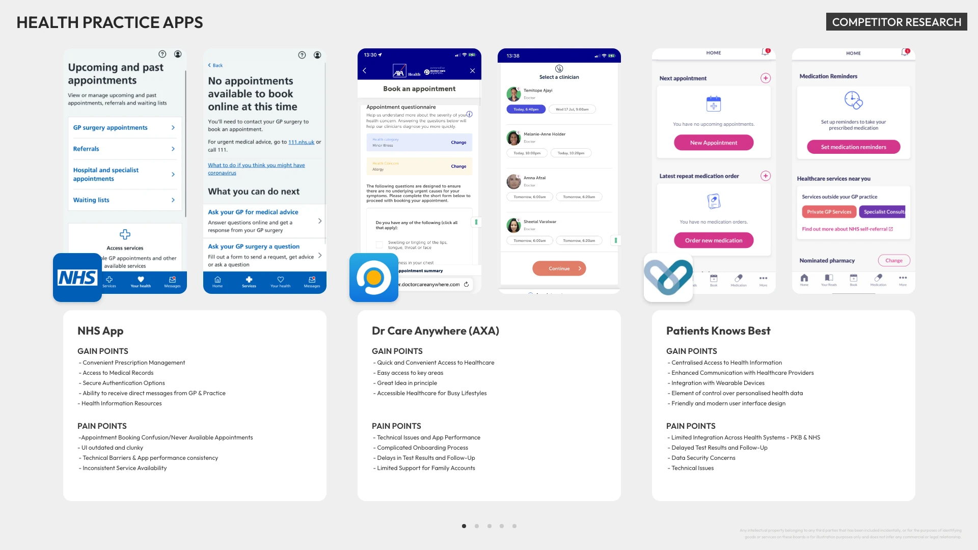
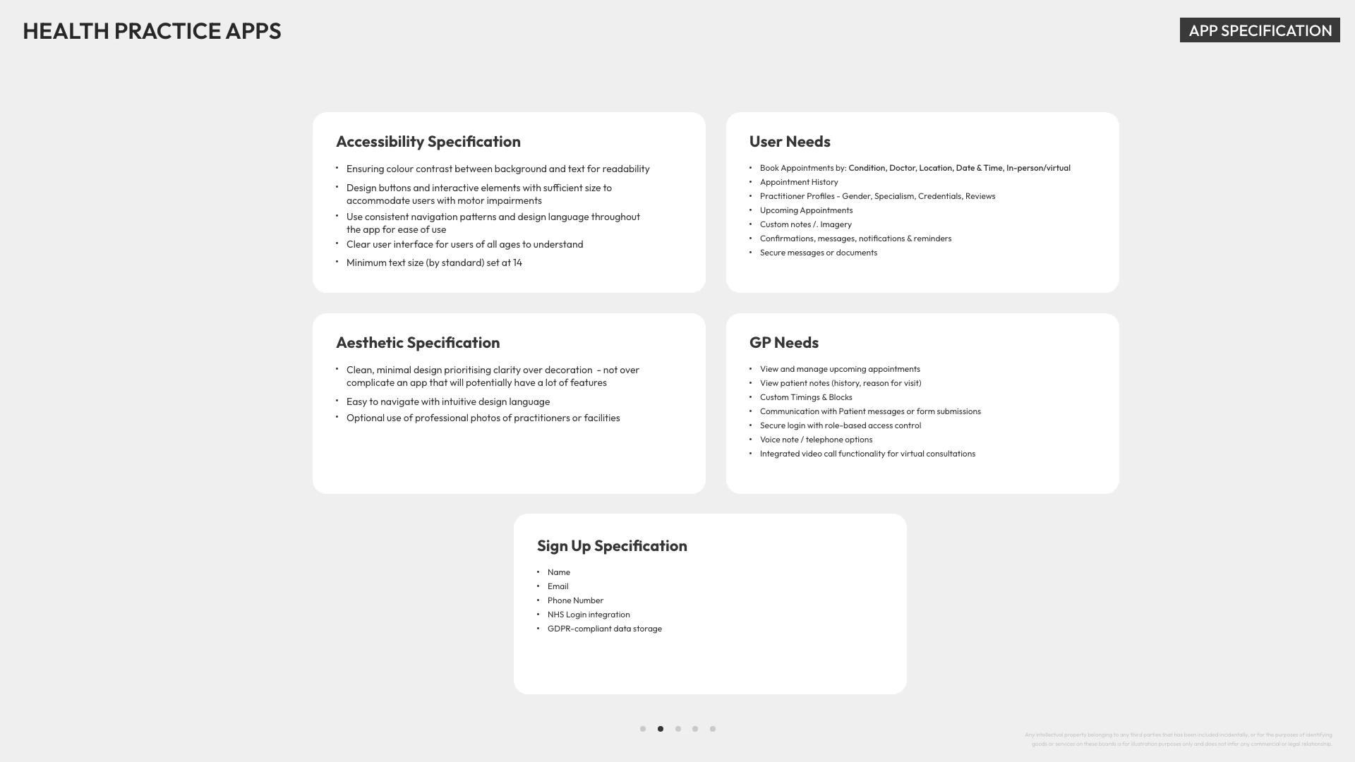
The first step was user interviews and competitor research. The pain points and gain points people had found in similar apps became the considerations for the specification.
Fig. 01
Competitor research across health practice apps, and the specification drawn from it. Open either to read it in full.
User flow
Three routes to one booking.
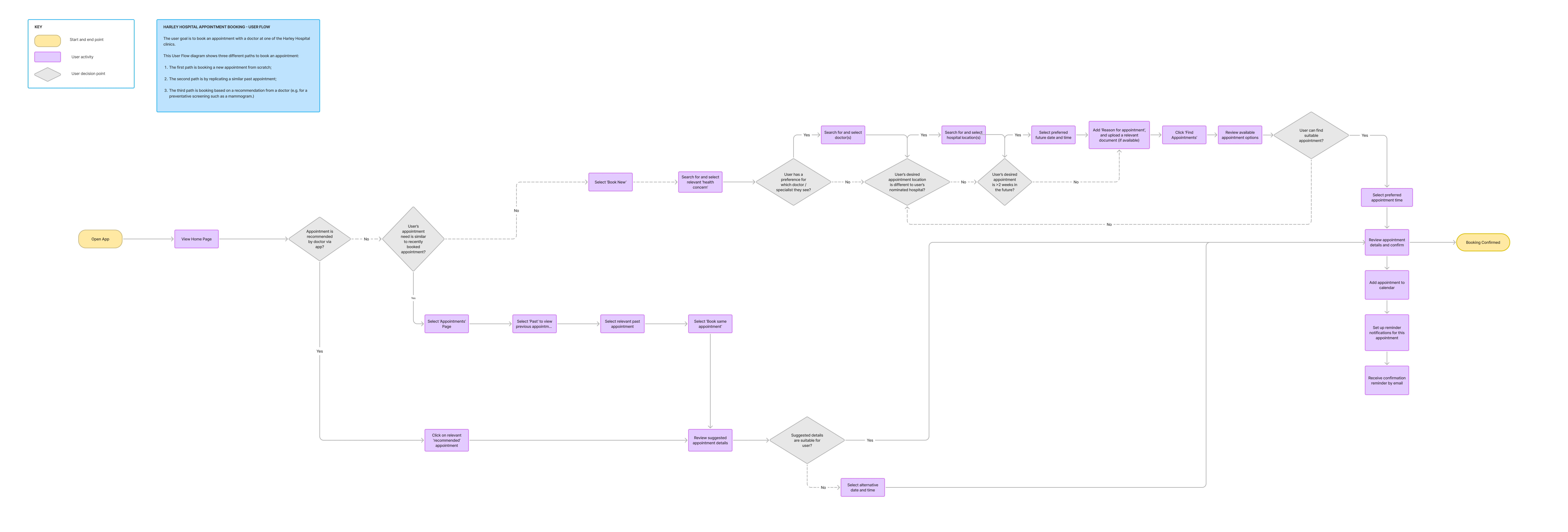
From the research I mapped the routes people would take to book an appointment in the Harley Hospital app:
- 1
A new appointment, from scratch.
- 2
Replicating a past appointment.
- 3
An appointment recommended by a doctor.
Fig. 02
The user journey flow, all three routes. Open it full size to read every step.
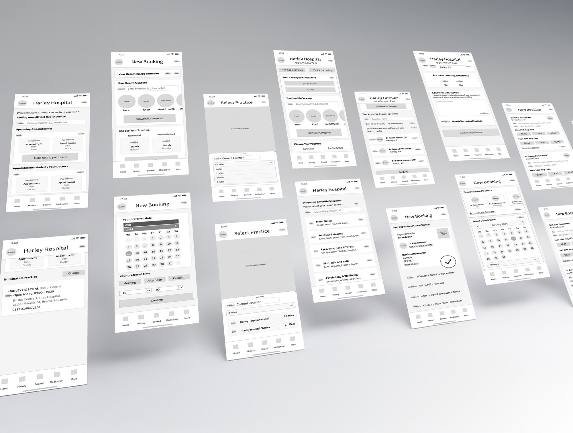
Low-fi wireframes
The routes, drawn out screen by screen.
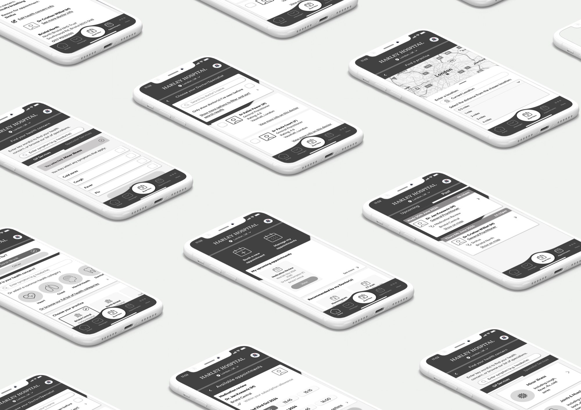
The flows were drawn up first as low-fidelity wireframes.
Fig. 03
Low-fidelity wireframes for the booking flow.
Mid-fidelity screens
The same routes, in mid-fidelity.
The wireframes were then taken to mid-fidelity screens for the Harley Hospital app.
Fig. 04
Mid-fidelity screens for the booking flow.